

Track mission-critical journeys
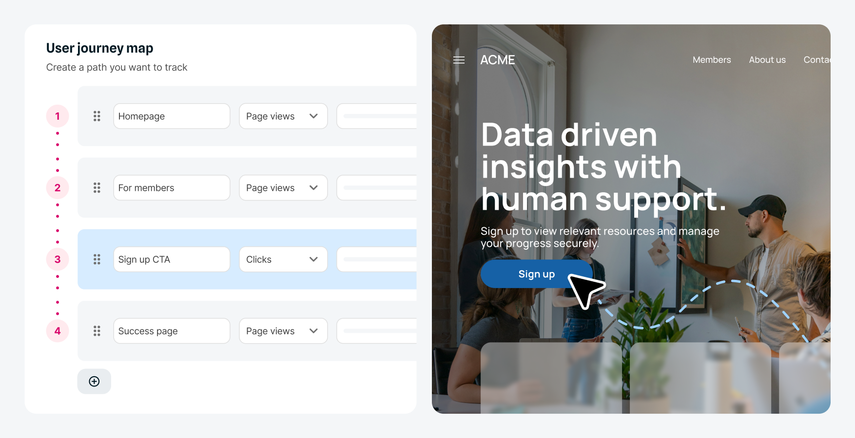
Define the exact steps in your key journeys - like registration flows or booking processes - and see exactly how users navigate your most important content and where they succeed or struggle.
Track the journeys that matter most to your organization, see where visitors drop off, and fix the friction points that hurt conversions. Turn behavior data into better experiences.
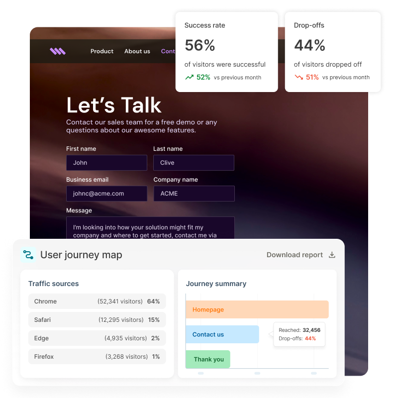
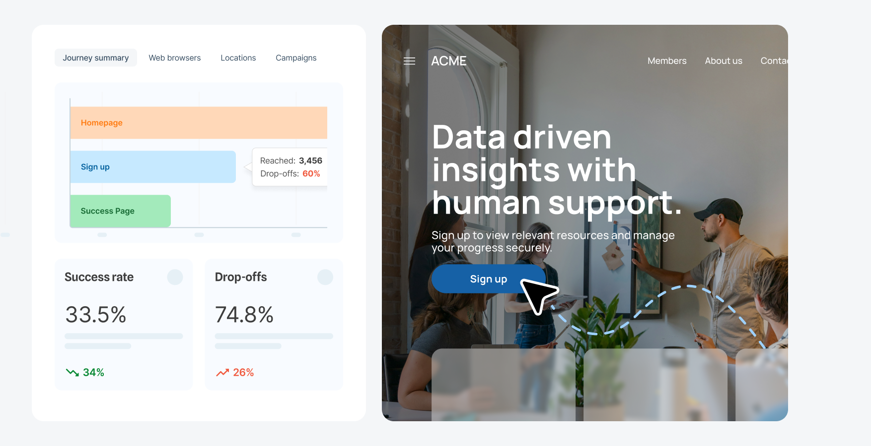
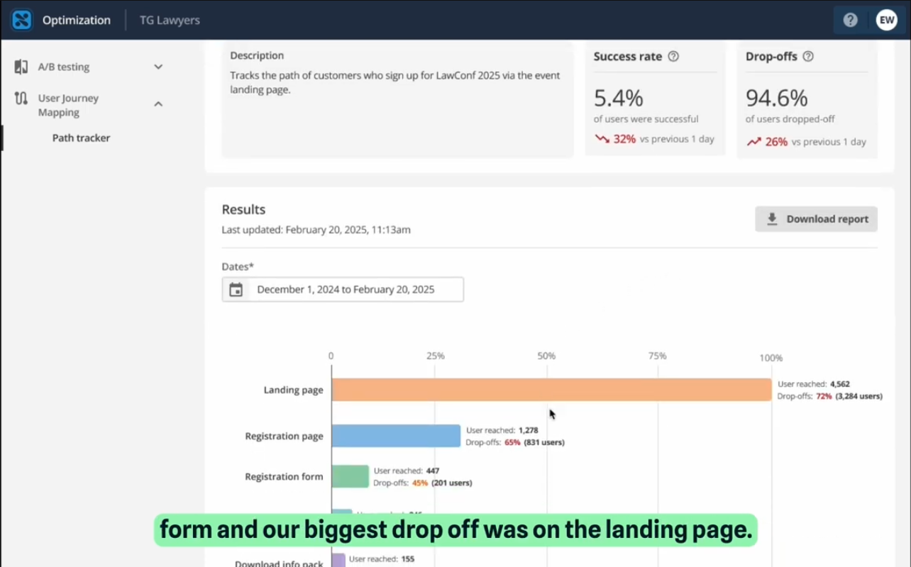
Remove the guesswork! With user journey mapping, visualize and analyze important user journeys to understand how visitors progress and where they exit. With easy-to-read tables and bar charts depicting each flow, see traffic volumes, engagement by device, progression rates and drop-offs between steps.
Define the exact steps in your key journeys - like registration flows or booking processes - and see exactly how users navigate your most important content and where they succeed or struggle.
Monitor how visitors progress through your key journeys with regularly updated reports showing traffic patterns, completion rates, and drop-off trends. Spot issues early and identify which paths perform best.
Use journey data to make informed decisions about where to focus your optimization efforts. Leverage A/B testing feature to test variations at the highest-impact points and measure results to ensure every change improves the user experience.

Compare journey flows by audience segments - like new vs. returning visitors or campaign traffic. Identify where specific audiences struggle and use those insights to inform personalization and conversion rate optimization strategies.
Pinpoint the specific pages and steps where users exit your key flows. Understand which elements create friction and prioritize optimization efforts where they'll have the biggest impact on conversion rates.
Video: See user journey mapping in action. Captions and transcript available on playback.
Watch how simple it is to set up integration flows, whether you're using existing recipes or building from scratch.
Turn journey insights into targeted experiences. With Squiz Digital Experience Platform, journey mapping connects directly to personalization. If a segment consistently drops off at the pricing page, you can personalize messaging and content to address what that audience needs. Mapping shows where the journey breaks down - personalization helps you put it right.
User journey mapping works hand-in-hand with A/B testing to deliver powerful results. Identify drop-off points with journey data, then test solutions at those exact friction points.
The visual interface in Squiz DXP’s user journey mapping feature makes building journeys and interpreting data straightforward for marketing and content teams. Clear dashboard reporting helps non-technical stakeholders understand insights and present findings to leadership without needing analyst support.
Squiz DXP’s user journey mapping feature has an intuitive interface that requires minimal training. Users can access comprehensive documentation in the Squiz Help Centre, free self-paced courses on Squiz Academy, and dedicated support via MySquiz for any specific questions.
You can track any multi-step process on your site like registration flows, application processes, contact forms, resource downloads, event bookings, or service inquiries. You define the steps that matter to your organizational goals.
Yes. Journey maps show where users progress or exit. Use this data to redesign steps, simplify forms, adjust content, run A/B tests, or personalize experiences for segments that struggle.