✨ NEW Content Intelligence is here! Make your content unmissable to AI search
Squiz Component Service example interface

Design System Management with reusable components

Give your team reusable building blocks to launch pages at speed. Developers create components once using your design system, and editors build pages with confidence, knowing everything stays on-brand. Manage hundreds of sites from one component library and update them all with a single change.

Design System Management built into your DXP

The Squiz Component Service is a design system management capability within Squiz DXP. It gives marketing teams a central library of reusable, brand-approved components that can be used across multiple sites. Editors build pages independently, while governance, consistency, and technical standards stay firmly in place.

Scale your design systems without scaling your team

Icon of a set of website components

One component library for every site

Your single source of truth for all components. Maintain one library with granular control, instead of juggling individual site components.

icon-circle-tick-webp

Built-in brand guardrails

Approved components and design system enforcement keep editors on-brand without manual checks or extra effort.

Icon Rocket

Start fast with pre-built components

Launch with Squiz Marketplace starters, then build custom components easily with familiar frameworks like React and JavaScript.

Built-in governance for brand consistency at scale

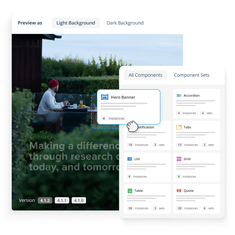
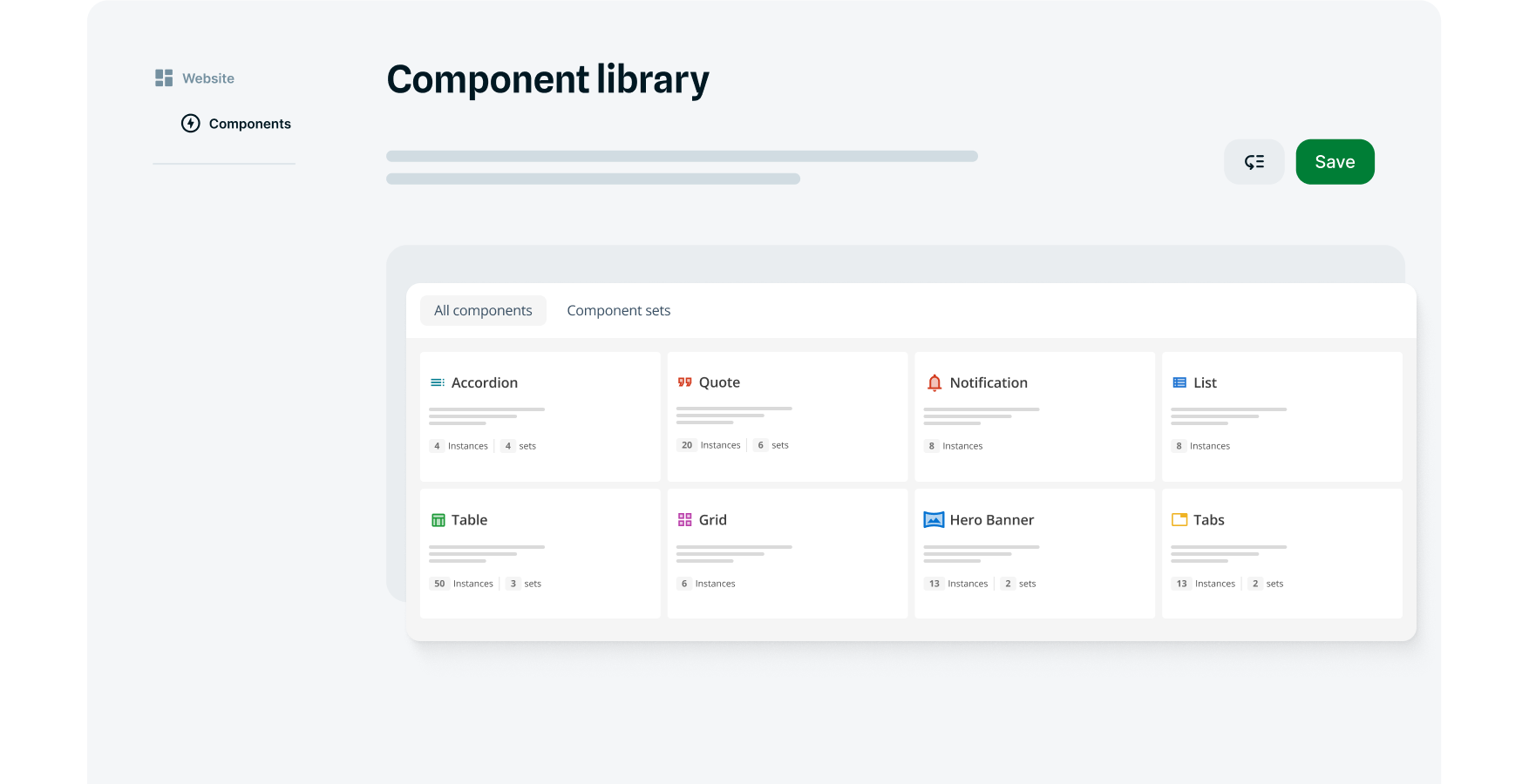
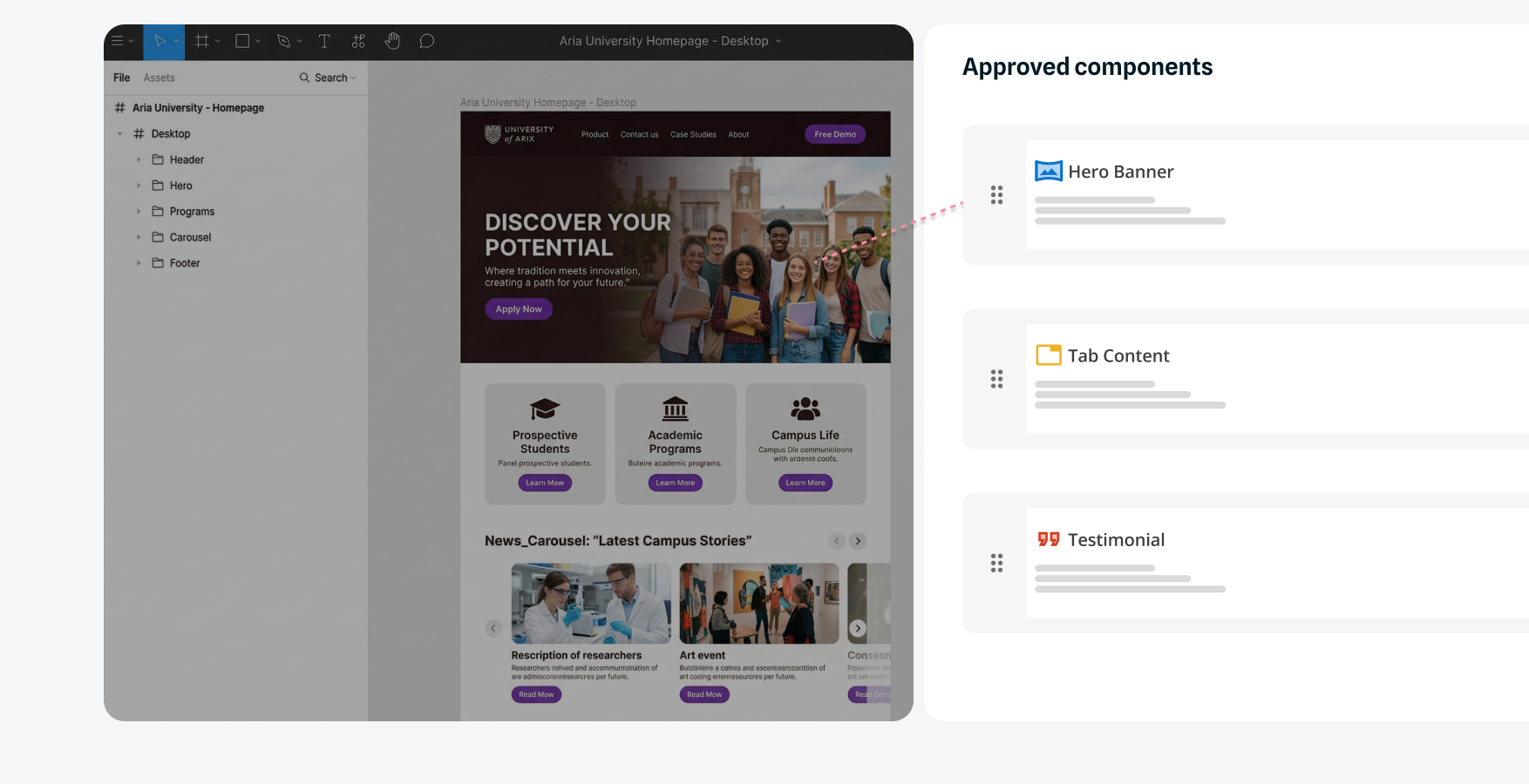
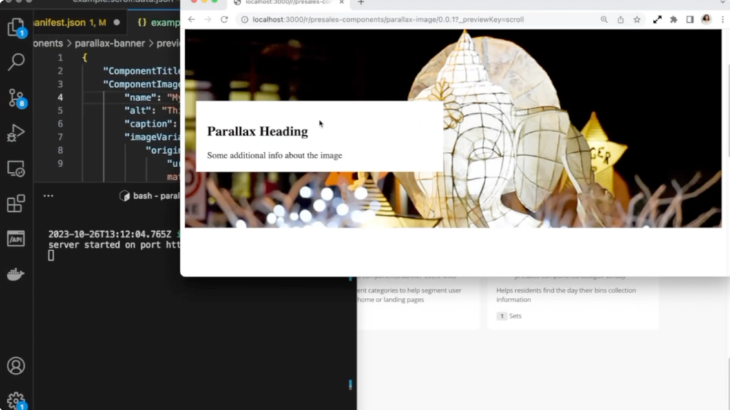
Build once, use everywhere

Manage all your hero banners, accordions, carousels, CTAs and more in one centralized library with version control. Developers build once, then editors build pages independently across your websites, apps, and portals. Pages that used to take weeks waiting for custom development now get built in hours.

Image of the Squiz component library

Scale across hundreds of sites

Different sites need different components. Control which sites access which component sets, then customize how those components look without maintaining separate versions. Push out a global fix once and watch it deploy across your entire digital estate. Each site keeps its unique styling while you dramatically reduce technical debt.

Example Squiz interface showing how web components can be used on multiple sites

Turn your design system into approved components that editors can use across all your platforms. Editors only have access to pre-approved components, so brand guidelines are automatically protected. No more off-brand pages or manual style checks. Governance happens automatically, without bottlenecks.

Feature description

Image showing web designs turning to components

☑️ Use the tools and frameworks you already know

Build components with standard HTML, CSS, and JavaScript using your existing development patterns. Deploy in headless or traditional architectures based on your needs. Work in your preferred code editor, manage code in Git, and deploy through your existing pipeline. No proprietary frameworks or vendor lock-in. Developers work the way they're used to, with better outcomes.

☑️ Start with 30+ ready-made components

Launch with a library of pre-built starter components on day one. Add custom components as your needs grow, or integrate third-party and vendor components to expand your catalog faster. Reduce time to value and build out your component library without starting from scratch.

Video: Watch components transform your workflow. Captions and transcript available on playback.

Watch components transform your workflow

See how the Component Service lets developers build once and deploy components across multiple sites. Learn how built-in governance keeps everything on-brand while giving teams the speed they need.

Benefits at a glance

Lower costs, faster launches

Reusable components cut build costs and accelerate delivery from weeks to hours across your sites.

Scalable multi-site management

Manage hundreds of sites and thousands of pages without expanding your development team or headcount.

Increased developer productivity

Free developers from repetitive component work so they can focus on strategic features that drive real value.

Complete editor independence

Empower non-technical teams to build pages with brand-approved components in an intuitive visual editor.

Consistent quality at scale

Create accessible, brand-compliant components once. Editors use them to build pages freely, knowing quality is automatically built in.

Safe, controlled updates

Test updates thoroughly before rolling them out, with the option to undo them instantly if needed. Push changes with complete confidence.

Edge-deployed for speed

Components render from edge locations closest to your users, delivering consistently fast page loads around the world.

sample-demo-CTA

See how LGA SA saved $2m in digital costs with components

Learn how the Local Government Association of South Australia cut website build time from 4 months to 3 weeks using the Component Service.

Frequently asked questions

Components provide developers a code-first approach to build functional components for websites, which can then be used by non-technical users in the Content Management editing interface. Components are framework-agnostic and can be built using standard web technologies including JavaScript, React, Vue, and other modern frontend frameworks - Squiz doesn't enforce a proprietary framework.

Code is deployed to a scalable JavaScript runtime environment, independent from the Content Management system, allowing developers a lot of flexibility around how they build their solution and manage their code.

The components use a JSON Schema to define the content model that is used within the component for rendering, and to automatically generate an editing interface in the CMS.